Psiog
Psiog is a mid-market IT services company. ChimpzLab partnered with Psiog to design its visual identity system, logo, custom typeface and brand guidelines, extending the same identity into the company's website.
ChimpzLab was engaged to build Psiog's brand identity from the ground up: naming architecture, logo, custom typeface and the guidelines to hold it consistent across every touchpoint.
Most IT brands default either to sterile enterprise blue or to generic "innovation" visual cliches that could belong to any vendor in the category.
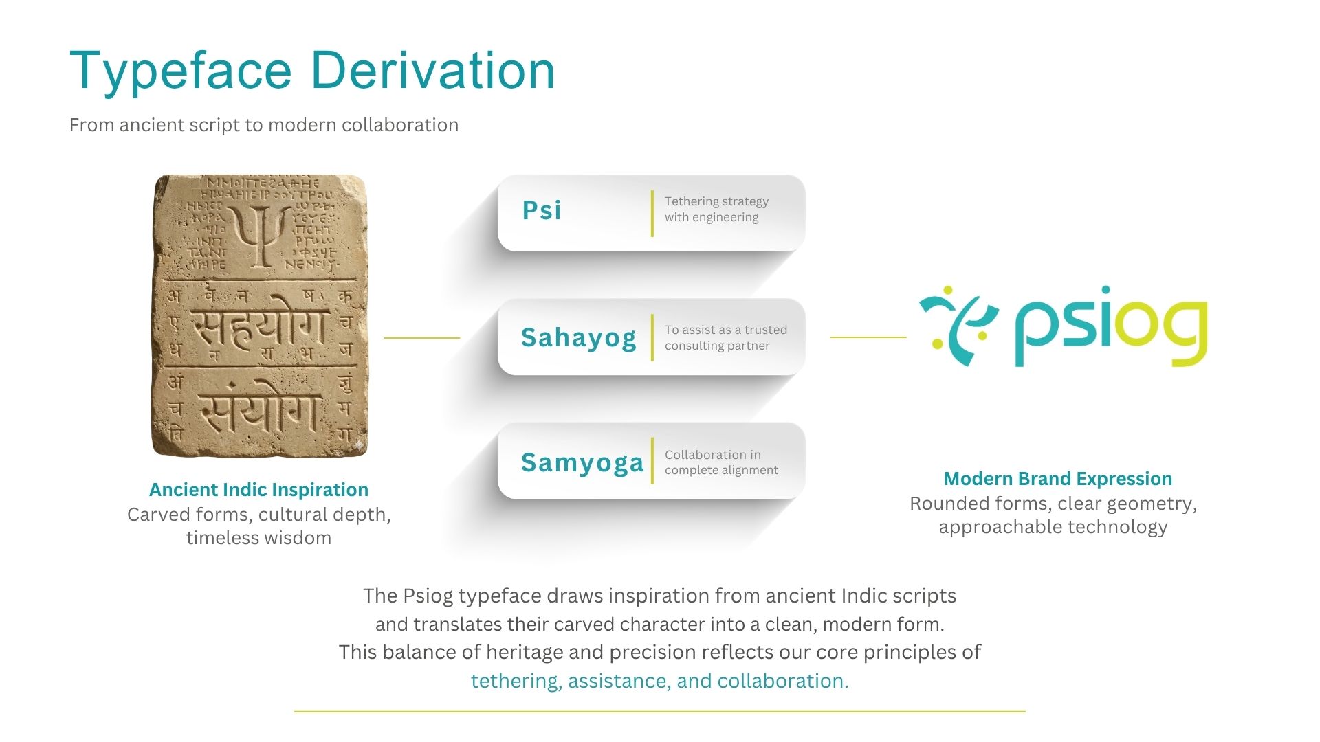
The identity was built outward from a three-part naming logic, so every visual choice could be traced back to a specific idea about how Psiog works with its clients.
Built on three pillars: Psi (tethering strategy with engineering), Sahayog (trusted consulting partner) and Samyoga (collaboration in complete alignment) — anchoring every design decision that follows.
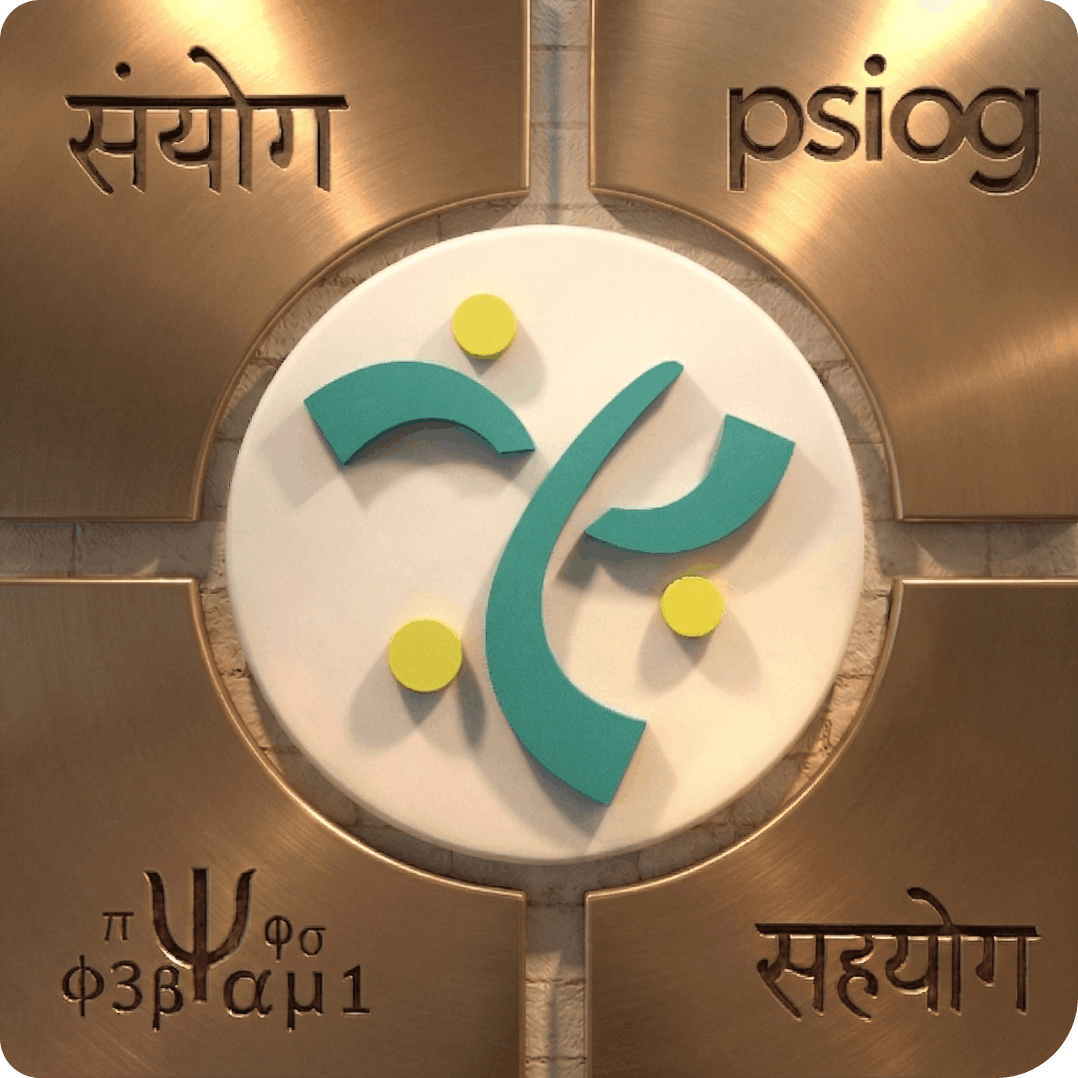
Derived from ancient Indic scripts — a carved, hand-cut character translated into a clean, modern form that still reads as technology-forward.
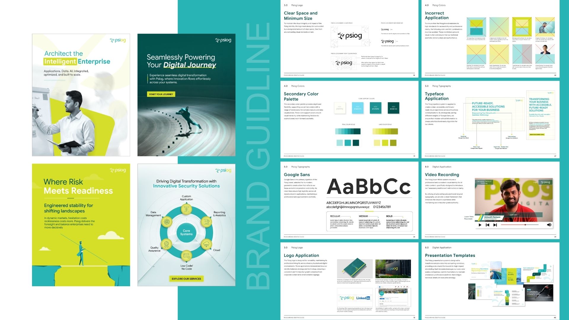
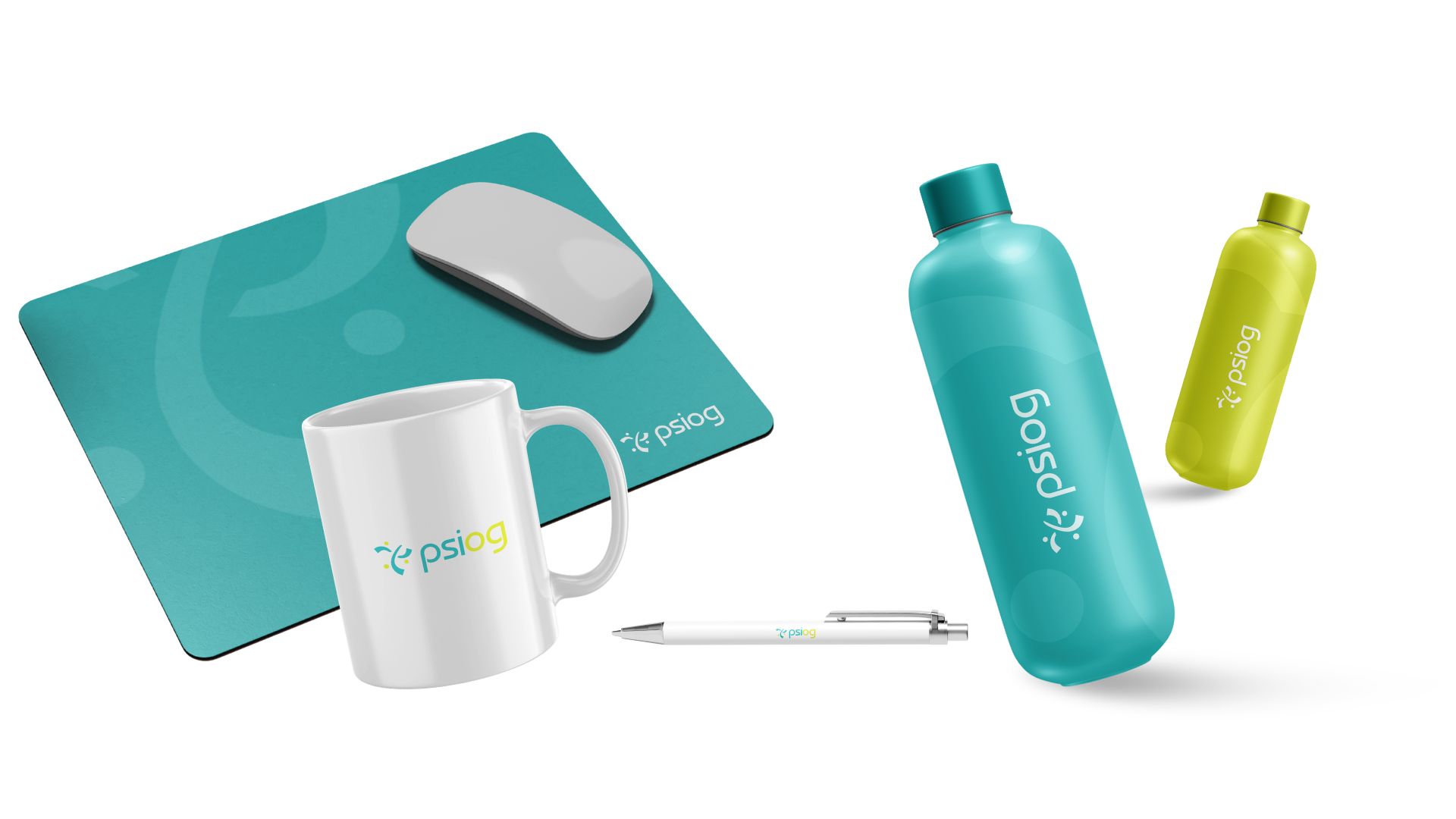
A full logo and brand guidelines system built to keep the identity consistent across documents, collateral and digital touchpoints.
Identity carried through to the website — the same visual language extended into psiog.com, the brand's primary digital storefront.
A complete visual identity system anchored in a custom, culturally rooted typeface rather than a licensed, off-the-shelf font.
Brand guidelines that give Psiog's team a consistent reference for logo use, typography and collateral going forward.
A naming and design language — tethering, assistance, collaboration — that ties the visual identity directly to how the company describes its own value to clients.
The identity extended beyond the logo into the company's live website, creating a seamless brand experience from first impression to engagement.
Let us audit your current communication footprint and build a reputation engine that works as one system.